About two days ago I can no longer display sectional charts on PiAware. When selecting any of the aviation charts I simply get a blank background. What I did notice is the comment on the lower right that says “Tiles courtesy of ChartBundle”.
A little investigating I believe the url’s for the charts are pulled from /var/share/skyaware/html/layers.js and the aviation charts from “wms.chartbundle.com/wms”, this URL does not resolve in DNS.
Is there another location to pull the charts from?
Same problem here, with both PiAware and SkyAware Anywhere.
I read once that there are open source stand alone software packages as alternative to PiaAware. Anybody have experience or recommendations (good or bad) for any of these packages?
Even if I could simply store tiles for my general area and have the software pull them locally. Since they aren’t be used for navigation updating them once ever few years is way more than needed.
Also I can’t image it would take a lot of storage space.
Apparently Chartbundle.com was a hobbyist, not a company effort.
This is the explanation from Chartbundle in another forum
Shut down due to a combination of too many outdated components on the system with security vulnerabilities and no time to fix and upgrade them all. Figured it was time to throw in the towel before something bad happened
The source code is posted on Github, but it is beyond my coding abilities.
Flightfeeder SkyAware maps will not show any of the US chart backgrounds, just a blank background except for the NEXRAD radar. All the Worldwide overlays are working.
For users with PiAwares, new sectional charts from the FAA were added in version 10.
For FlightFeeder users, the charts have not yet been integrated into the latest FlightFeeder version. We will pull in the charts on the next FlightFeeder update, but we don’t have a timeline for that at the moment. We will keep you updated once we do!
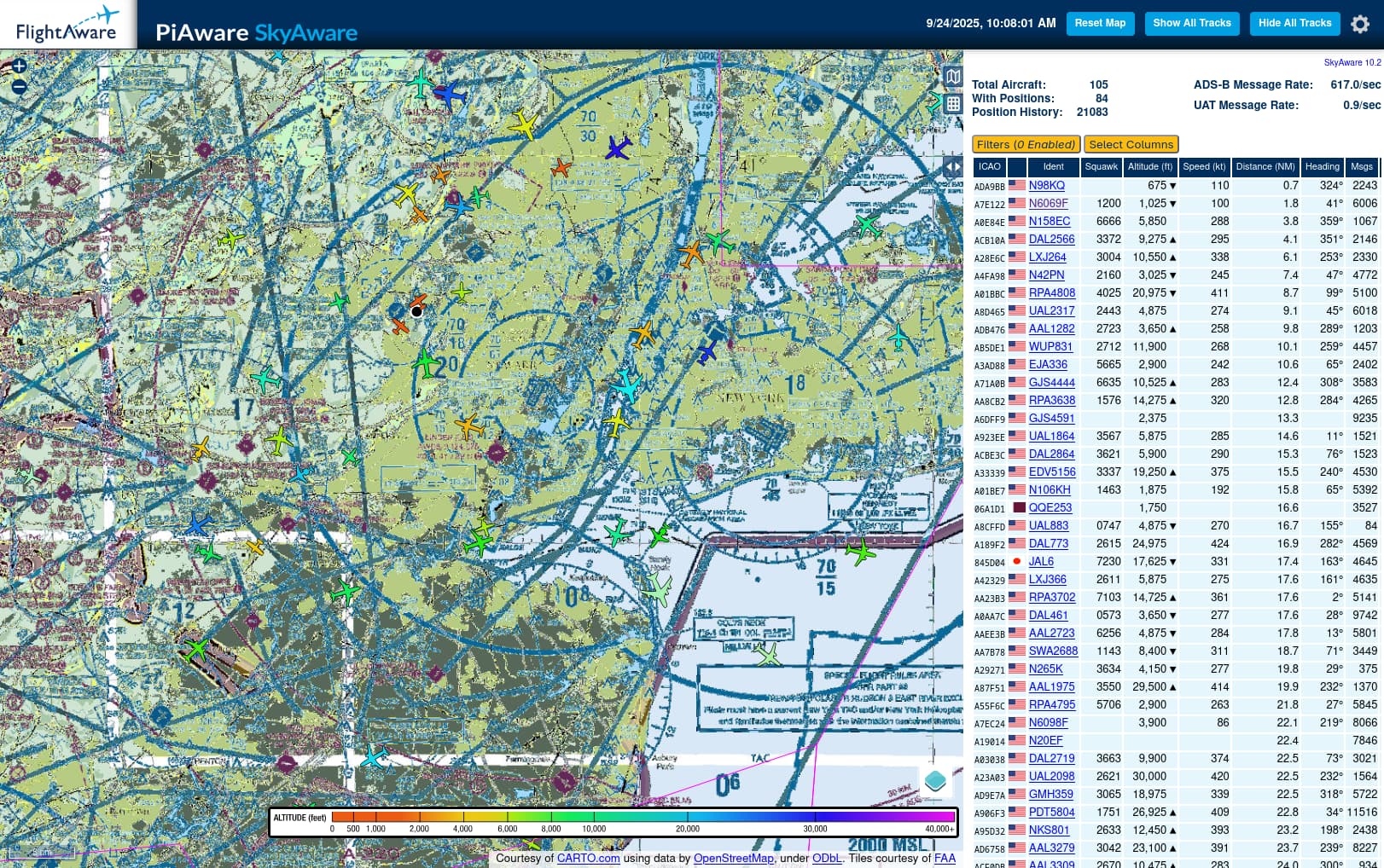
I’ve finally upgraded to Flightfeeder 10 (web interface says SkyAware 10.2) and I now have the VFR section & terminal, plus the IFR Low charts (IFR high don’t show but I don’t need them anyway.
Problem is whatever method that was used to rasterize the image is absolutely awful, before today only the yellow areas on the charts were poor, today the display of the chart is beyond awful, see attached. The chart shown is centered just NW of EWR.
The terminal chart is just as bad, the IFR low chart and the OSM maps all display fine.