wiedehopf,
I appreciatively & respectfully disagree 
Please don’t remove it.
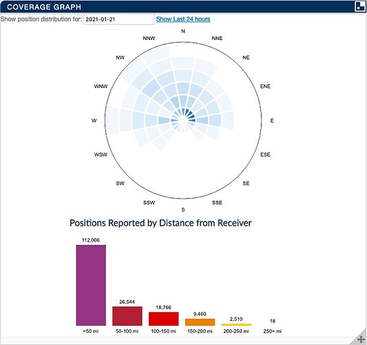
This specific graph and pondering why my tracks with single message or more than one message was the trigger point for discovering I needed to make some changes. It was extremely valuable as the pathway lead me to a whole new level of understanding.
Thank you!!!
JWarner2,
I hope this time-lapse video of charts, aircraft on map & data table view may help. Please forgive the roughness of it. I’m still working on a better capture to better highlight elements for those seeking better understanding (me included). Stepping the video forward frame by frame may assist in connecting the relationship dots.
Notice in the graph how the ratio of pink vs. green shift depending on various conditions. Having tracks with more than one message suggests a quality of sequence that’s good. Wiedehopf speaks truth that single message tracks are also positive and not general bad indicators.
ADS-B performance analysis / chart1090 time lapse visualization (sample A)
I’m working on a followup video capture that is more focused and easier to digest. This video was a proof of concept test (following repairs) from last week. I had made multiple ‘improvements’ to a different receiving station only to result in horrible performance. Source of my receiving position message performance issue turned out to be the value of “rtlsdr-gain max” in my default gain setting. Oops 
Very humbling…
I found that taking my gain down to 38.6 allowed the largest range of strong to weak radio transmissions to be received. Watching the range of RSSI values in PiAware can help identify patterns and associated elements.
I would suggest clicking on an aircraft nearby on the map and monitor the ‘TRACKING INFORMATION’ section in changes for ‘Last Seen’ and ‘Last Position’. Results of ‘now’ indicate goodness. Increasing second counts can be cause by a multiple of factors (not limited to gain, antenna positioning, nearby radio interference, cabling or connector concerns and line of sigh issues).
Topography of the landscape played a noticeable roll in this video. Mountain range directly behind the receiver blocks most of the aircraft to the south.
Map: Google Maps
Seeing large amount of red in the ADS-B Message Rate graph may indicate your losing position reports due to over saturation of receiver. -3dBFS is a strong signal. This combined with a narrow range of green in the ADS-B Signal Level graph suggests that receiver may be getting peaked out more times than less.
I’ll update this reply once I can generate a new sample video.
Any requests on what ‘live’ data video scenarios would be useful are most welcomed!
![]() *
*


