
I was proposing this for the benefit of all others and have the source script in github updated. The ability to scale the images with small and larger screens is nice and saves scrolling
Ctrl + or - in the browser should be sufficient.
With your new version of the script, I noticed that now the plot is no longer reversed, but at home it has been flattened at the same position.
PM sent and sorted. I had a height difference between the script and HWT of 8m which I didn’t think would make much difference. It did …

Thanks Caius
You are still getting that straight line though - that shouldn’t be there unless it’s something you’ve added yourself.
This is now added - images should autoscale to screen width.
How do you mean? Does the line that’s produced correspond roughly with the angles on the horizon shown in the heywhatsthat profile page?
1 Like
Nothing I’ve done - honest! I wouldn’t have a clue how to do it.
quick question:
Can the black background changed somewhere in a script or do i need to enable my photoshop skills afterwards?
Forget my problem, it’s solved ;+)
1 Like
Why don’t you look into the script and understand how the picture is produced.
A little hint: it’s using gnuplot.
So you google background color for gnuplot and try to find that in the script.
Another quick question:
Are these two lines equivalent? (looking at the script to understand more!)
set title 'Close range signals - '.date tc rgb “white”
or
set title "Azimuth/Elevation plot ".date tc rgb “white”
single vs. double quotes
Seem to work either way. Or, is one preferred over the other?
In this case they are functionally equivalent. There’s no good reason for them to be different here, just an oversight. There are reasons to use different quote marks in some circumstances however.
For example, if you want special characters like \n for a new line to be processed then you have to use double quotes. In a single quote, it will just be printed. Also if you want to use double quotes in your text, you have to enclose it in single quotes.
Thank you. Appreciate the quick reply!
Thanks for the hard work on this script. Ran it for 24 hours; looks cool.
What types of data are included in the plots? I get lots of TIS-B and some MLAT. I am interested in looking at ADS-B only (maybe this is already the case).
Also, is there a way to consider only ground traffic (defined as: altitude == “ground”)? I can approximate by limiting numerical altitude, of course. Is ground traffic included, and how is it handled? I would interested in a plot that only uses ADS-B ground traffic
The data will include anything that appears in the json files - if you are feeding MLAT and UAT into dump1090, then those will appear.
At present, the data fields extracted from the aircraft.json are latitude, longitude, rssi, and barometric altitude. json fields explicitly excluded are those with invalid lat/lon and those with a signal strength of -49.5, which is not a real value - it’s a value given to anonymised mlat results and those which you aren’t directly receiving (eg when it’s out of range but the server is still sending results to you).
The value “ground” isn’t explicitly handled at the moment. If it exists in the data I think it will get filtered out as it’s a non-numeric value. Altitudes of 0 will be present in some cases, but that will be likely from aircraft without weight on wheels sensors so won’t include most ads-b aircraft or ground vehicles. I occasionally see aircraft on the ground at London City so will try to grab some data then for testing.
You could modify the parameters used to extract data from the json to remove MLAT or TIS-B - I don’t ever see any UAT or TIS-B data in the UK so without an example to work from I’m not sure what format the data takes in the json. I probably won’t remove MLAT aircraft from the script (though maybe make it selectable at some point), but I can see the point of removing TIS-B as it’s rebroadcast data.
If you want to have a look at how the data extraction works, then have a look here: jq play
That’s an example of an aircraft.json and the filter used to pull the data into the format used by the script. Note that the filter is slightly different for data coming from timelapse1090 because of how the data is packed together.
Edit - After a quick play, it seems it’s pretty simple to filter MLAT in or out, so it’s probably similarly easy to exclude TIS-B. If someone sends me an example aircraft.json that includes TIS-B aircraft I can make that change.
Re: background color. Not sure I fully understand but have questions. ![]()
Background color is set for the first 3 plots (All, High, Low)via:
set terminal pngcairo dashed enhanced size 2000,2000
…lines omitted for some clarity…
set object 1 rectangle from screen 0,0 to screen 1,1 fillcolor rgb “black” behind
Later on (for elevation/azimuth et al), we are changing the size, so we have to state the background color again? Or does the background color carry over?
set terminal pngcairo enhanced size 1920,1080
…lines omitted for some clarity…
set object 1 rectangle from screen 0,0 to screen 1,1 fillcolor rgb “black” behind
Does “reset” on a line by itself dictate that we do have to redo the color/pallete?
Also, once we have “set terminal pngcairo enhanced size xxxx,yyyyy”, we do OR do not have to specify it again? I see it used for the Azimuth/Elevation Plot, then again for Elevation Heatmaps, but skipped for the Close Range Altitude Plot?
Sorry for so many questions, I am RTFM for Gnuplot and googling but it wasn’t clear. Thanks!
It seems consistent that “ground” aircraft do not get included, and that MLAT does. I am not sure about TIS-B. In the picture below are 24 hours of the tail end of Runway 1 (far left) and Runway 28 (center, situated in the bay) of San Francisco airport. To the right of Runway 1 is water. One might expect that the point cloud between 1 and 28 should mostly not be there. They are likely MLAT reports. I doubt they are TIS-B reports. Regardless, if this was only ADS-B then the dots should be on the taxiways and runways only.
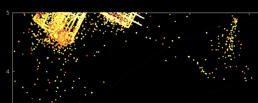
When I tried to re-do this plot in 10 minutes, I got like 5 dots only. Hence my suspicion that “ground” is excluded. (I could show a picture, but it would be black).
I will look at the link and see if I can make sense of it to exclude some aircraft.
The background is just set as a black rectangle that is placed behind everything else.
Basically, yes. The reset line clears all settings and returns them to default. It’s there because it was easier to set up the following graphs from scratch than undo all the settings for the polar graphs using unset commands. Settings remain in force until they are changed with another set command, switched off with an unset command, or reset.
You only have to restate it if you want to change terminal settings such as size or type, or after it’s been cleared with a reset.
I have spent a great deal of time looking at gnuplot documentation and it’s still not always clear how it works. There’s also a lot of outdated documents about, some of which are still relevant and some are superseded. It’s often more informative to find an example somewhere and adapt it to what you want. I also use the GUI output to experiment as you can quickly change things and replot without having to edit files, run scripts and copy images about.
1 Like
Ground is almost certainly excluded because of the way the calculations are done. I’ll amend it so they are handled properly and counted as 0 altitude instead.
MLAT aircraft are definitely included at present. I will probably add a switch to exclude them if required.
Or on the ramp / in a hangar / other non-movement areas. Or any of the above plus a random offset due to avionics falling back to dead-reckoning data. Or any of the above plus a random offset due to GPS not getting a good signal (this is notably an issue with aircraft that are powered up while inside a hangar; they can report a position that’s hundreds of meters away from the actual position)